|
James Hilbert Nickel: Artist in Venture
II. Brentwood, Missouri
Jim’s studio in Brentwood, Missouri, was next door to Standard Pipe Protection Co., a business that wrapped sections of pipe in protective coatings for construction oil pipelines. It was a great place to scrounge for materials. The plywood end caps, which the company discarded when shipments of new pipe sections arrived, became raw material for his “Circle Pieces.”
The story of Nickel’s arrival at the Brentwood studio and his embrace of the artist’s vocation is important for understanding his work. Growing up in the Chicago area, his early aesthetic interests were stimulated by frequent visits to the Art Institute of Chicago and by the city’s magnificent architecture. He studied philosophy in college in the days when existentialism was the reigning “ism,” but his formal art education was limited to art history. He attended Concordia Seminary in St. Louis, intending to study for the Lutheran ministry. Courses in theology and biblical languages, together with his studies in philosophy, prepared him intellectually to value the paradoxes and ambiguities of life, the changes and chances of which we try to make sense, the historical and biblical layers created by preceding generations that can shed light on who we are and to what end we live.
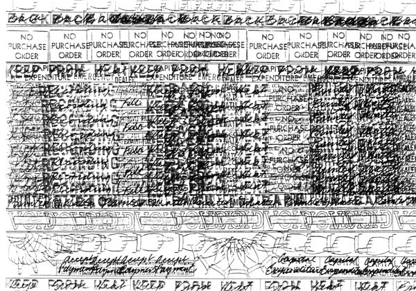
Rubber Stamp drawings
His fascination with bureaucratic imperatives —VOID, DO NOT FILE! — led to a series of rubber stamp drawings, made with stamps he found during odd jobs. He gave many of the stamps to nephews and neices.
Some of his vocational wrestling comes to the surface in the 1972 rubber stamp drawings. This series of graphic works was precipitated by Nickel’s acquisition of old rubber stamps containing bureaucratic imperatives from the St. Louis Post Dispatch, where Nickel worked on the loading dock. These small works use stamped images in a repeated compulsive pattern with graphic overlays. They are small signs with huge irrefutable, authoritarian commands that dominate the mind. The series includes No Purchase Order, right, Void, Keep from Heat, Moved—Left No Address, Back, Duplicate Copy O.K. (which is intended as a subtle insinuation about art reproductions), and the nervous hand with pointing finger visually suggesting the path to follow but stymied and frustrated by circuitous overlay. All these signs contained existential implications that were relished by the young artist, and helped relieve the pressure to move forward with his work and break into the world of art marketing and recognition. In the Weather Report Series (drawings from 1976, all 10 x 12 inches) the stamps and local radio weather news collide on paper in the uncertain atmosphere of forecasting, working the verbal/visual mode that Nickel has favored from time to time.
The catalyst for Nickel’s 1969 move to art school was an unpaid campus parking ticket at the Seminary, whose penalty began to double daily after he refused on principle to pay the fine. When the school maintenance department removed the distributor cap from his badly rusted Plymouth Valiant to disable the car and force payment of the fine, Nickel purchased a new cap from an auto parts store, packed up his belongings and enrolled in the fine arts program at Washington University a few blocks away.
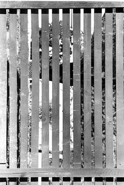
Depth perception and layers
The photographic excursions involved the artist in what was there. He was attracted to layerings — venetian blinds, slatted fences, grids that obscured the background and organized perception into layers.
The ability to render the human figure was in Nickel’s mind the chief mark of an artist, and that challenge created an insecurity which prevented earlier movement in this direction. He found that he could master anatomy and grew to love sketching skeletal structure. He discovered an art language to discuss composition and design, a discovery that had both positive and negative implications. The logical, descriptive rationale behind making art was often at odds with the intuitive freedom of his artistic instinct.
While Nickel was still at the Seminary he met Ernoe Koch, a master printmaker and artist from Hungary, who had lost all his tools, supplies, and art work twice in both World Wars. Koch had been trained in Budapest in the classical tradition and had emigrated to the United States through Canada after the war. He produced his best work in the last five years of his life. Koch had cut the blocks for five-color woodcuts on religious themes. Nickel and other friends helped Koch print an edition of each work and mounted a show at the Seminary library. Later, when Nickel needed a job and Koch needed an assistant to enlarge his maquettes into large outdoor sculptures, Koch taught Nickel arc and gas welding so that the work could be completed and installed. When Koch died in 1970, Nickel inherited the studio, a concrete-block garage designed for truck maintenance, bought Koch’s tools from his widow, and completed Koch’s last commission. His share of the income from that installation paid the rent and bought food for ten months, and his art career was off and running.
Discovering one’s artistic language can be a daunting challenge. Where does one start? What stimuli can prompt self-expression? Nickel had inherited a studio darkroom and a camera, so he set out on his ten-speed bike with a camera loaded with black and white film to “see what he could see.” He set aside preconceived notions of what to look for, and instead focused on “what was there.” Gradually themes started to appear — fences and texture shots of screens and walls, right, Venetian blinds pulled down with light lapping in and around the slats, a foreground grid obscuring and camouflaging the background. Double meanings appeared in the tension between foreground and background, between the static and dynamic, which mirrored the push and pull of his daily life. Nickel reveled in the logical and visual contradictions of paradox.
A second theme that emerged was related to advertising. He began to notice huge billboards whose message was at odds with the circumstances of their urban location: a cool mountainous scene selling Kools appearing in the asphalt jungle of St. Louis. The discontinuity of this “landscape within a landscape” made more of a statement than the commodity being advertised. His critical eye also noticed signage with cautionary imperatives, like the notice on a railroad flatcar: SECURE ALL CHAINS. The less we are aware of dangerous elements in our environment, the larger the cautionary imperatives must be. Some of the ideas he discovered through photography went directly into the paintings on which he was working. He worked in three media simultaneously: painting, wood sculpture, and photography, even though these media at the time seemed unrelated.
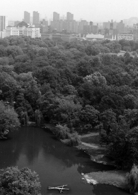
Six Lines
The artist set rules for assembling and reassembling pieces. For Six Lines (1979), installed in Central Park, each line intersected every other line, and each line included exactly one right-angle intersection.
Detritus from industrial processes provided material for sculpture. Across the railroad tracks from the Brentwood studio was a plant which applied protective wrappings to pipe destined for the Alaska oil pipeline. The pipe arrived on large flatcars secured by oak beams which were later discarded. Some of that oak found its way into the Six Line System Construction from 1971: six intersecting boards, each 16 feet long, asymmetrically arranged. This construction was the prototype for a later New York era piece — the 1979 Six Lines, a large floating sculpture anchored in the middle of a lagoon in Central Park. Viewed at a distance from above, the vanishing points in the piece resemble the visual pattern of airport runways. The Six Lines construction uses a minimalist control for the design: the lines contain only one right angle, and every piece intersects the other five at one point, but never do three lines intersect at the same point. The angles are worked out with great precision on paper before the wood is cut. Similar angles and lines surface in the large paintings, when Nickel stretched string stencils across the canvas.
In another sculpture series 4-by-4s were cut and compactly arranged in offsetting vertical and horizontal sections like a Lincoln Log fort. One of these sculptures resembled a mushroom and another resembled an organ pipe chamber. Redwood Piece of 1972 is a prime example of such architectural sculpture. Mathematical progressions played a part in the cutting and rearranging of boards, sometimes with declarative words added, like Perishable (this sculpture has roots in the photographs; it is a visual contradiction, given the steel and wood from which it is constructed). Standard Revision (plywood, 36 x 106 x 12 inches), Zebra Piece (zebra wood, 34 x 130 x 2 1/2 inches), and 36 Pieces (plywood, 64 x 115 x 7 inches), all from 1977, are each cut from a single piece of wood or plywood. The progressions are determined mathematically and the pieces are cut, reversed and reassembled with “nothing lost but the sawdust.” The original dimensions of a 4-by-8 piece of plywood are stretched at one end and shrunk at the other, bending the sculpture as if the wood were malleable.
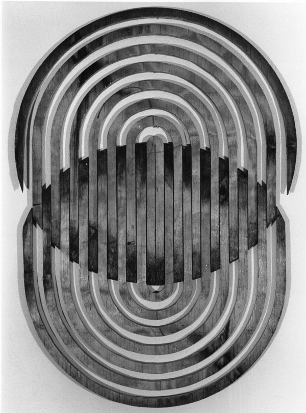
Circle Piece
Circle Piece began as a single end cap from Standard Pipe. The artist cut it into C-shaped sections, pulled them apart, flopped alternating pieces and reassembled it into two overlapping circles.
Nickel proceeds with a fairly consistent work pattern, devising a structural system (measuring, plotting out, enlarging through progressions and intervals), marking one board or flat sheet of plywood, cutting and reassembling to elongate the material. Stenciled letters or numerals are added to some constructions to highlight the progressions. This “reorganization of matter” provides an unexpected visual treat. The weathered wood is reconfigured, set in motion and comes alive again. Circle Piece (1977, plywood, 43 x 30 inches), right, used discarded plywood end caps from the pipe shipments, cut in concentric circles and expanded with alternating ribs flip-flopped, suggesting an accordion action of pulling the center apart. This piece prefigures the more elaborate constructions of the 1990s made from Baltic birch plywood.
There is a compulsive side to art-making that drives the artist from within, and such an impulse is apparent in these works. Call this compulsion a muse or an obsession, it expects to be satisfied, but seldom is. Nickel often talks about “cranking out” his work, whether paintings, drawings, or sculpture, but such language belies the effort and struggle that goes into each piece. Art-making is a discovery process, because once the work is set in motion it takes on a life of its own and will talk back to its creator — raising questions, challenging intentions, and mimicking grand descriptive explanations. In the mind’s eye of the artist foraging in the industrial junk heap, the discarded oak plank virtually begs to be picked up, carried back to the studio and worked on, containing its own internal imperative. It desires to be transformed and noticed on some gallery wall. In Lutheran theological language this act would be called “grace” — reclaiming the broken, discarded and abused for a renewed higher purpose.
The Brentwood studio paintings (1970 to 1978) evolved from photographs but exhibit similar structural elements found in the wood sculptures. Canvas formats were usually large (often 8 x 12 feet) and were painted flat, stretched across a platform stage. Paint was applied with brush, paint-soaked strings, and spray gun. The “string paintings” had their genesis in carpenter’s chalk line stretched across a surface. Nickel liked the tactile feel of snapping the line and watching the blue chalk diffuse outward from the strong center line. He set the blue lines with fixative, and painted in, over, and around them. Some of these early snap-line paintings made veiled references to traditional landscapes; others moved in a purely geometric direction. He also created approximately ten “tar paintings,” using heavy mixtures of black tar and sand on canvas, shaping texture by pulling strings through and out of the surface. Some strings were left buried in the tar. The overall effect was stunning — a sculptural relief created by transforming common and inexpensive materials into a soft-looking black velour surface.
Painting
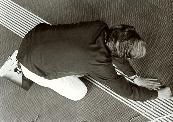
Masking tape and strings stretched across the canvas served as stencils, allowing the artist to create large canvasses with great depth and the interplay of multiple layers.
As the paintings evolved, Nickel painted large shapes as the ground and then stretched cords over the surface, now using the strings as a stencil. He painstakingly masked thousands of small alternate rectangles over the entire surface of the canvas so that the finished painting resulted in a herring-bone texture, and sprayed his own formulated primary color acrylic paint across the canvas. A striking feature of the Brentwood studio was a 55-gallon drum of Rhoplex, an acrylic medium, which was an expensive indulgence at the time. A large “X” is noticeable in the ground of the 1974 painting purchased by the St. Louis Art Museum. From a distance the canvas looks like a tapestry. The hard-edge parallel lines appear to bulge optically where they cross. String-stenciled strata of red-yellow-blue blended lines appear to glow with internal warmth, contradicting the cool objective geometry of the design. From 1970 to 1978 Nickel produced approximately 60 paintings in a variety of size formats using this labor-intensive technique. Each painting explored the distance between the obscuring frontal grid system and the colored field. At one moment the eye is becalmed by the pattern; the next moment it is bestirred by the random directions of parallel lines bulging in an optical illusion.
Visitors to the Brentwood studio viewed the paintings by climbing a ten-foot step ladder to look down on the platform, where Nickel would unroll paintings that had been stored on plastic drain tile. Through a network of contacts, Nickel’s paintings were first exhibited at the Mark Twain South County Bank thanks to the friendly influence of Adam Aronson, and in 1975 at the Terry Moore Gallery in Laclede’s Landing, a riverfront area of loft buildings.
The Venture Series of wood wall sculptures had its origin in a typical Jim Nickel photographic foray. He photographed the black and white diagonal stripes that covered the upper exteriors of the Venture Department Stores in various St. Louis area locations. “Venture” is a strong, suggestive word, but in a commercial advertising context it rings with humorous hyperbole. Do shoppers really “ad-venture” within those walls? Why not mix things up a bit and really create a “venture” with a treatment that excerpts and transforms an advertising logo into a personal quest for discovery? Nickel’s lively sense of humor is based on irony and the exposure of cosmetic pretension. To further mix the mundane with the cerebral, Nickel recalled a quotation from his college philosophy studies by the German philosopher, Martin Heidegger, which influenced his attitude toward creativity at the time and tied together the confluence of idea, image, and sculpture in the single word “venture.”
The ‘violent one,’ the creative man, who sets forth into the un-said, who breaks into the un-thought, compels the unhappened to happen and makes the unseen appear — this violent one stands at all times in venture... In venturing to master being, he must risk the assault of the nonessent...he must risk dispersion, instability, disorder, mischief. The higher the summit of historical being-there, the deeper will be the abyss, the more abrupt the fall into the unhistorical, which merely thrashes around in issueless and placeless confusion.
An Introduction to Metaphysics: Martin Heidegger
Doubleday/Anchor Books, NYC, 1961, p. 135.
The brave creative venture is personally serious, but “being-there” seldom reaches the height of a summit or the depth of an abyss. Instead, searching takes place between summit and abyss where the stark black and white striped barriers unintentionally raise life-directional questions. Venture Series became the transitional work that took Jim Nickel from St. Louis to New York, the city toward which he was venturing all along. Though thrashing around a bit, he did fall into the historical. Like the “progression pieces” made from scrap wood, the “Venture pieces” use plywood, cut up, painted and re-assembled with geometrical patterns of progression. The surface structure is then contradicted with wavy, parallel lines gouged into the surface of the painted plywood with a router, suggesting roads or streams that, while encouraging traffic and movement, also confuse progress with overlap and indirect intersection. These undulating lines raise the question whether arrival will ever happen.
Next: New York, New York
|